Mastering Color Theory for Your Wardrobe

Color is one of the most powerful tools in personal style. It can influence how we perceive a garment, how we feel wearing it, and how others perceive us. Yet many people find choosing colors that harmonize with their natural features to be a challenging task. This article explores color theory as a practical framework for building a wardrobe that works with your unique coloring. Rather than offering prescriptive rules, it focuses on understanding the principles behind color selection, so you can make informed decisions based on your own preferences and context.
The concepts of color theory have been applied across art, design, and fashion for centuries. By translating these principles into wardrobe planning, you can create a collection of clothing that offers versatility and visual coherence. This guide will walk you through the essentials: understanding your natural coloring, learning basic color relationships, and applying that knowledge to assemble a coordinated palette. The goal is not to dictate what you should wear, but to provide a framework for thoughtful experimentation.
Understanding Undertones: The Foundation of Personal Color
Before diving into color combinations, it is essential to recognize that each individual has a distinct combination of skin tone, hair color, and eye color. These features are often categorized by undertones, which are the subtle hues that exist beneath the surface of the skin. Undertones generally fall into three categories: cool, warm, and neutral. Cool undertones are characterized by pink, red, or bluish hints, while warm undertones display yellow, peach, or golden hints. Neutral undertones are a mix of both, making them flexible for many color choices.
One common method to identify undertones involves examining the veins on the inside of the wrist. In natural light, if they appear more blue or purple, cool undertones are likely; if they appear greenish, warm undertones are indicated. However, this method is not foolproof and can vary with lighting conditions. Another approach is to hold a piece of white paper next to your face without makeup; if your skin looks yellowish or sallow, you may have warm undertones, whereas pinkish or rosy comparisons suggest cool undertones. These tests are only starting points, as skin undertones can shift with tanning, age, and other factors.
Hair color also contributes to your overall coloring, but it is not necessarily aligned with your undertone. For example, an individual with cool undertones might have naturally ashy blonde hair, while someone with warm undertones might have strawberry blonde or golden brown hair. If hair is dyed, it can alter the overall contrast and affect which colors appear most harmonious. Therefore, it is helpful to observe your coloring in a holistic way, considering both skin and hair together rather than isolating one feature.
Once you have a general sense of your undertone, you can use it as a guide for selecting clothing colors that tend to blend well with your natural features. This is not to say that you cannot wear colors outside your identified range—fashion is experimental and personal. Instead, undertones serve as a baseline for creating a palette that feels cohesive and comfortable.
The Color Wheel and Basic Relationships
The color wheel is a visual representation of colors arranged according to their chromatic relationship. Primary colors (red, blue, yellow) are the base; secondary colors (green, orange, purple) result from mixing two primaries; and tertiary colors are combinations of a primary and a secondary. Understanding the wheel helps in recognizing complementary, analogous, and monochromatic color schemes, which are commonly used in outfit planning.
Complementary colors sit opposite each other on the wheel, such as blue and orange or red and green. These pairs create high contrast and can be striking when used in moderation, often appearing in statement pieces or accent accessories. Analogous colors are neighbors on the wheel, such as blue, teal, and green, providing a more harmonious and soothing look. Monochromatic schemes use variations in lightness and saturation of a single hue, offering a sophisticated and easy-to-wear approach.
In practice, understanding these relationships can assist in mixing pieces from your wardrobe. For instance, if you have a navy blazer, you might pair it with a burnt orange top for a complementary look, or with a light blue shirt for an analogous effect. These are not rules but visual strategies that can be adapted to your taste. Additionally, neutral colors—black, white, gray, beige—serve as anchors in a palette, providing balance and allowing more vivid colors to stand out when desired.
Analyzing Your Skin Tone and Hair: A Practical Exercise
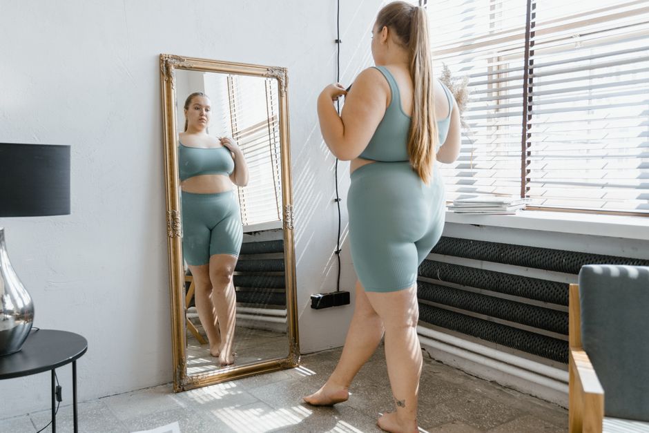
To apply color theory to your wardrobe, begin with a systematic assessment of your natural coloring. This exercise is best done in natural daylight, away from artificial lighting that can distort hues. Pull your hair back or cover it with a neutral scarf to focus on your skin, and wear a white or gray top to avoid reflection. Observe your skin in the mirror, noting any discoloration, redness, or sallowness. Many people find it helpful to compare their skin to a range of fabric swatches in various tones (cool, warm, and neutral) to see which group seems to harmonize best.
Consider swatches of pure white and cream, as well as vivid cool hues like magenta versus warm orange-red. Notice whether your face appears more vibrant when next to one set of colors or the other. This can give you clues about which families of colors may complement you. However, this test is subjective because lighting and personal preferences can influence perception. Therefore, it is valuable to bring along a friend whose opinion you trust, or to take photos in consistent lighting for a more objective comparison.
Hair analysis involves determining the base tone of your hair. If you have natural hair, look at the strands near your roots, as they are the most undyed. Consider whether your hair reflects ash (cool), gold (warm), or neutral undertones. Red or auburn hair typically indicates warm tones, while platinum or ash blonde suggests cool tones. For those with dyed hair, think about the effect of that color on your skin. For example, a very warm golden blonde may wash out a cool-toned face, whereas a cool ash brown might create an unflattering contrast if your skin is very warm.
Once you have this information, you can begin to curate a list of colors that you feel are most flattering. This list is not a restriction but a starting point for building a wardrobe that makes you feel confident and authentic. Remember that color perception is personal and can change with the seasons, your health, and even your mood, so it is reasonable to revisit this assessment periodically.
Building a Versatile and Coordinated Color Palette
With an understanding of your natural coloring and color relationships, you can move on to constructing a color palette that is both effective and versatile. A crisp, coordinated palette simplifies dressing because every piece can be easily mixed and matched. The typical approach involves choosing a set of neutrals and accents that align with your undertone. For a cool undertone, neutrals like black, white, gray, and navy often pair well; for warm undertones, earth tones such as beige, camel, and olive can serve as anchors.
Begin by selecting 3-5 neutral colors that you like and that harmonize with your skin and hair. These will form the backbone of your wardrobe. Then, choose a few accent colors that you enjoy and that fall within your identified color range. Accents can be complementary or analogous to your neutrals, depending on the desired effect. For example, a cool palette might include charcoal, white, and light gray neutrals with a teal accent, while a warm palette might feature tan, cream, and brown with a terracotta accent.
As you shop, use this palette to guide your purchases. Before buying an item, ask yourself whether it fits within your chosen color scheme and whether it can be combined with at least three other items you already own. This practice encourages thoughtful buying and reduces the accumulation of orphaned pieces that are difficult to wear. A well-coordinated palette does not mean wearing only one color family; it simply ensures that your clothing works together to create a unified and intentional appearance.
It is also important to consider the occasion and the message you want to convey. Bright or saturated colors can draw attention and express energy, while muted, deeper tones tend to feel more formal or subdued. Contextual factors like professional settings, social events, and personal comfort should influence your final selections. Ultimately, the palette you build should reflect your lifestyle and taste, not an abstract ideal of beauty.
Applying Color Theory in Practice: Outfit Combinations
After establishing your palette, the next step is to apply your knowledge when assembling outfits. One effective method is to start with a base neutral and then build around it with one accent color. For instance, if you have chosen a navy blue base, you might pair it with a complementary coral top, adding a third piece in a soft neutral like beige. This creates a visually balanced look without feeling overwhelming.
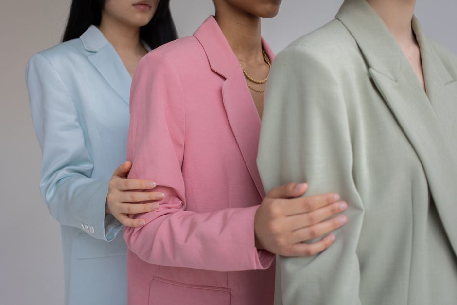
Analogous combinations provide a subtler alternative, using colors that are next to each other. Wearing olive green, forest green, and a soft mint can create a harmonious effect that is easy on the eyes. Such combinations are often safest for those new to color coordination, as they naturally blend. Monochromatic dressing, using two or three shades of the same hue, is another approach that adds sophistication while simplifying decisions.
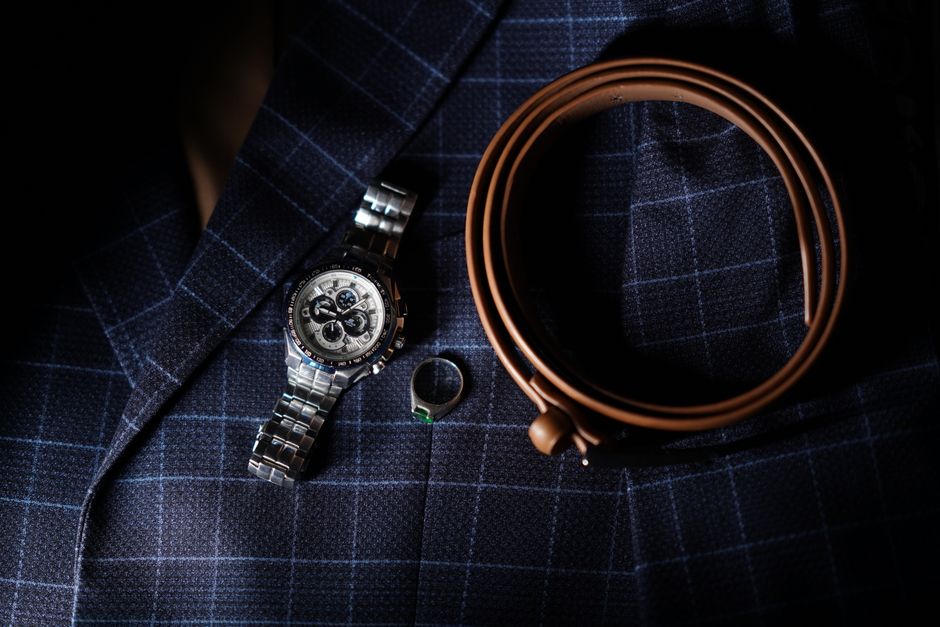
Accessories provide an excellent opportunity to experiment with color without committing to a large piece. A scarf, handbag, or pair of shoes in a complementary hue can elevate an outfit that is otherwise composed of neutrals. For example, a beige outfit with a royal blue belt or a warm mustard cardigan can introduce a focal point. In these cases, the color wheel serves as a guide for choosing combinations that either contrast or harmonize based on your preferred style.
Patterns that incorporate multiple colors can also be managed with this framework. When wearing a patterned garment, such as a floral blouse or a plaid shirt, select one of the least dominant colors from the pattern for your accompanying pieces, or choose a neutral that appears within the design. This helps to anchor the look and ensures that the overall outfit does not become visually chaotic. The key is to practice, observe what pleases you, and adjust based on your own reactions and those of your environment.
Contextual Considerations: Seasons, Lighting, and Individual Variation
Color perception is not static; it can be influenced by environments and contexts. The lighting under which you view a color affects its appearance—for example, incandescent bulbs cast a warm glow, while fluorescent lights have a cooler, bluish tint. Daylight, which is the most balanced, is the truest representation. This matters when choosing outfits for various settings, as a color that looks harmonious in a fitting room may appear different in natural light or under office lighting.
Seasonal changes can also impact how colors appear on you. During summer, skin may tan or develop freckles, altering the interplay with certain hues. Hair may lighten due to sun exposure. Consequently, a color palette that worked in winter might need adjustment for summer, and vice versa. This is not a reason to overhaul your entire wardrobe each season, but it suggests flexibility in choosing which pieces to prioritize.
Cultural associations with color can influence its effect as well. In many Western cultures, black is associated with elegance and winter, while white is a summer staple. In some Eastern cultures, white symbolizes mourning. Since fashion is inherently social, the meaning we attach to colors is partly learned. When selecting an outfit, considering the immediate cultural context—such as a workplace dress code or a formal event—can be as important as personal fit.
Ultimately, each person has their own unique visual characteristics, and the goal of applying color theory is to provide a structured way to think about clothing choices. It is not an exact science but a heuristic that can reduce decision fatigue and increase satisfaction with one’s wardrobe. Being open to experimentation and mindful observation allows the theory to evolve with you.
Color is the place where our brain and the universe meet. — Paul Klee
The journey to mastering color theory for your wardrobe is an ongoing process of self-discovery and practical application. It involves learning the language of colors, listening to your own aesthetic instincts, and fine-tuning your choices based on real-life experiences. No palette is objectively correct; rather, you curate a collection that reflects your personality and meets your needs. As you gain confidence in recognizing color relationships, you will find that dressing becomes an enjoyable exercise in creativity.
Remember that clothing is a form of communication, and the colors you wear contribute to the message you send. By approaching color selection with a balanced and informed mindset, you can build a wardrobe that feels both authentic and functional. Whether you are exploring complementary contrasts or subtle analogous combinations, let your own perception guide you, and allow the concepts outlined here to serve as a supportive framework.